Service Type
Watch App
Project Status
Utilized in Samsung's internal proposal document
Role
Team Member | 30% (4 UX Team members)
Tool
Powerpoint, Illustrator, Photoshop


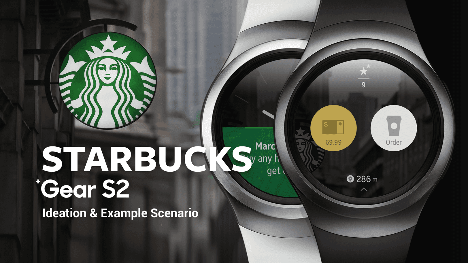
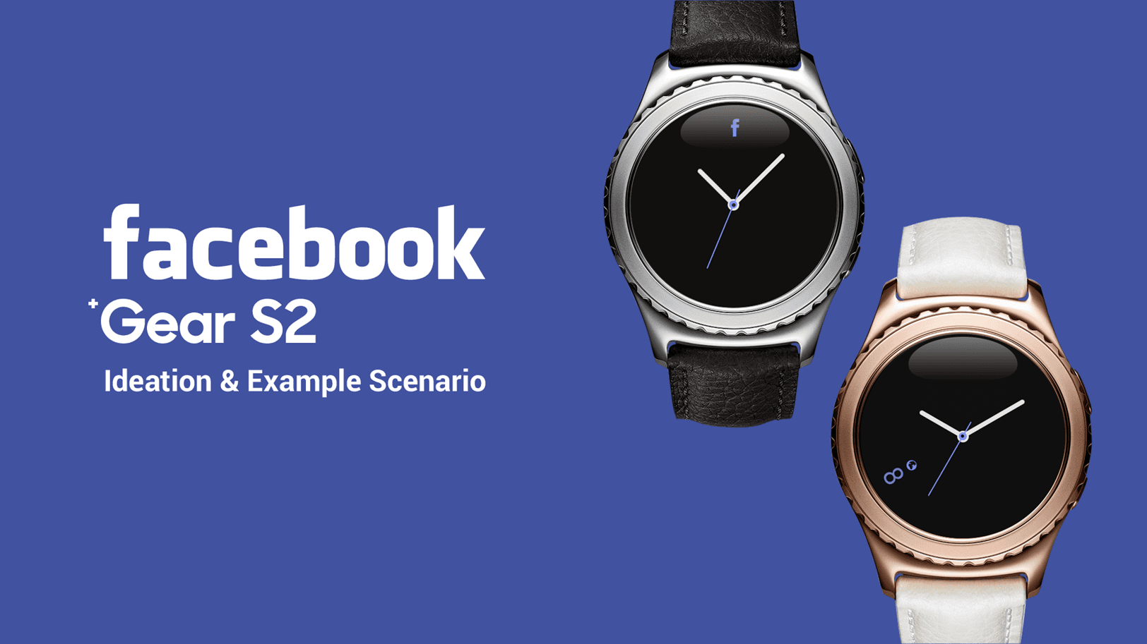
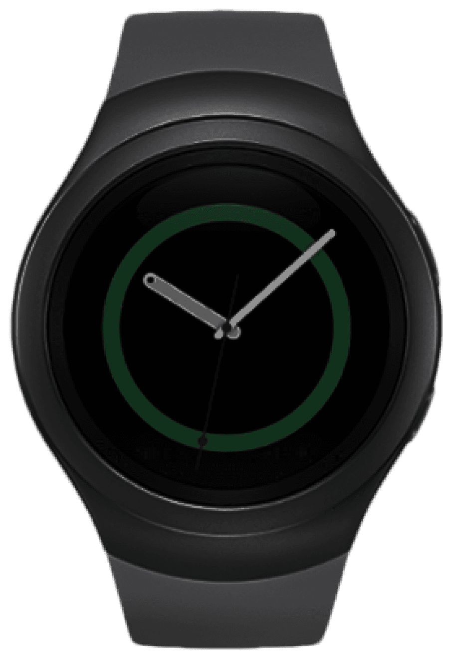
Samsung Gear S2 UX Proposal For Starbucks, Facebook
Prior to the launch of the Gear S2, Samsung Electronics collaborated with major companies such as Starbucks, Facebook, and Instagram
to expand the third-party app market. We conducted a project to propose UX concepts for S2 services. We derived key concepts tailored to each service
and developed primary UX scenarios that would be most effectively utilized on the Gear S2.
Work Process
In the Discover phase, I conducted brand analysis, user research, and product analysis for Gear S2. Subsequently,
I defined the main tasks for each brand and developed scenarios and designs that leverage the distinctive features of Gear S2 to best embody the identity of the target brands.


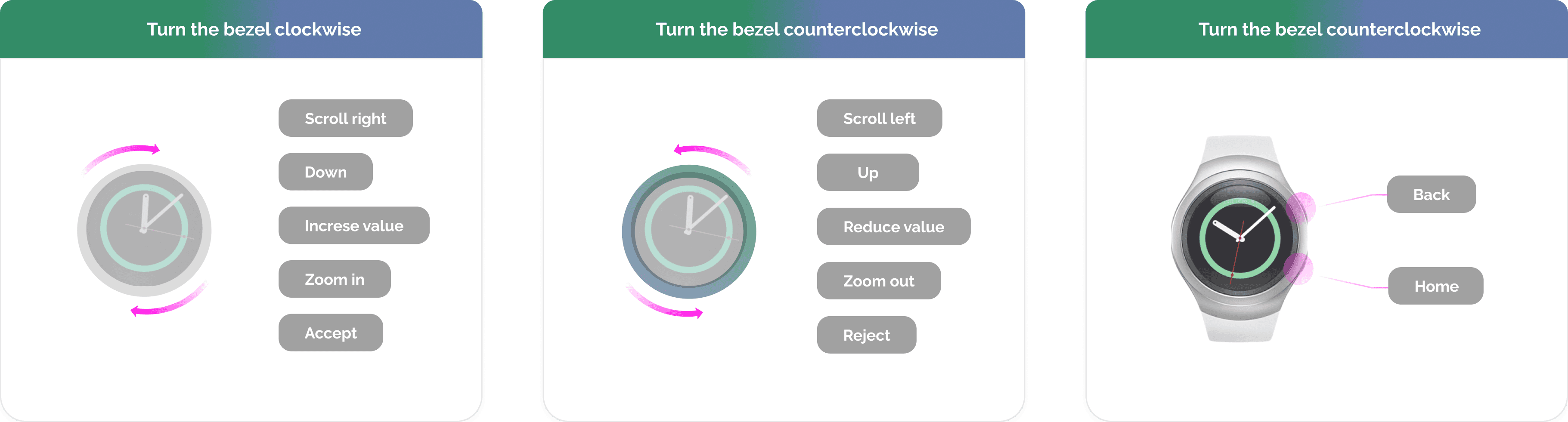
Understanding Tizen Basic Interaction on the Gear S2
I conducted a detailed analysis of the Bezel Interaction method on the Gear S2 for guideline purposes
Touch Interaction
Zoom in
Zoom out
Double Tap
Select
Tap
Swipe right
Swipe left
Swipe


Open Quick Panel
Bezel Swipe Down
Scroll up
Scroll down
Scroll

Select Mode
Touch and hold
Scroll
Roate
Lists
7
8
9
5
6
4
4
5
6
2
3
1
11
12
13
9
10
8
Swipe
Roate
Pages

Scroll
Roate
Cards
TEXTTEXTTEXTTEXTTEXTTEXTTEXTTEXTTEXTTEXTTEXTTEXTTEXTTEXTTEXT
TEXTTEXTTEXTTEXTTEXTTEXTTEXTTEXTTEXTTEXTTEXTTEXTTEXTTEXTTEXT
TEXTTEXTTEXTTEXTTEXTTEXTTEXTTEXTTEXTTEXTTEXTTEXTTEXTTEXTTEXT


Vertical View and Horizontal View
User Research
I have identified key issues based on user surveys
3. Select Payment
Select a Starbucks card as the next step.
Watch app provides only a Starbucks card for payment.


What should be considered when designing the Gear S2 UX for the Starbucks app?
Based on the key insights derived from user surveys, I have identified relevant keywords and insights that can be applied to Starbucks app.
Co-Experience

Keep the main concept
Consistent in color and icon
Similar experience in navigation
Log Data

Outdoor / Indoor use (Purchase)
Minimal User Interaction
Personalized Information
Watch Context
Glanceable
Attractive in circle
Use outdoor use in store
Simple Task


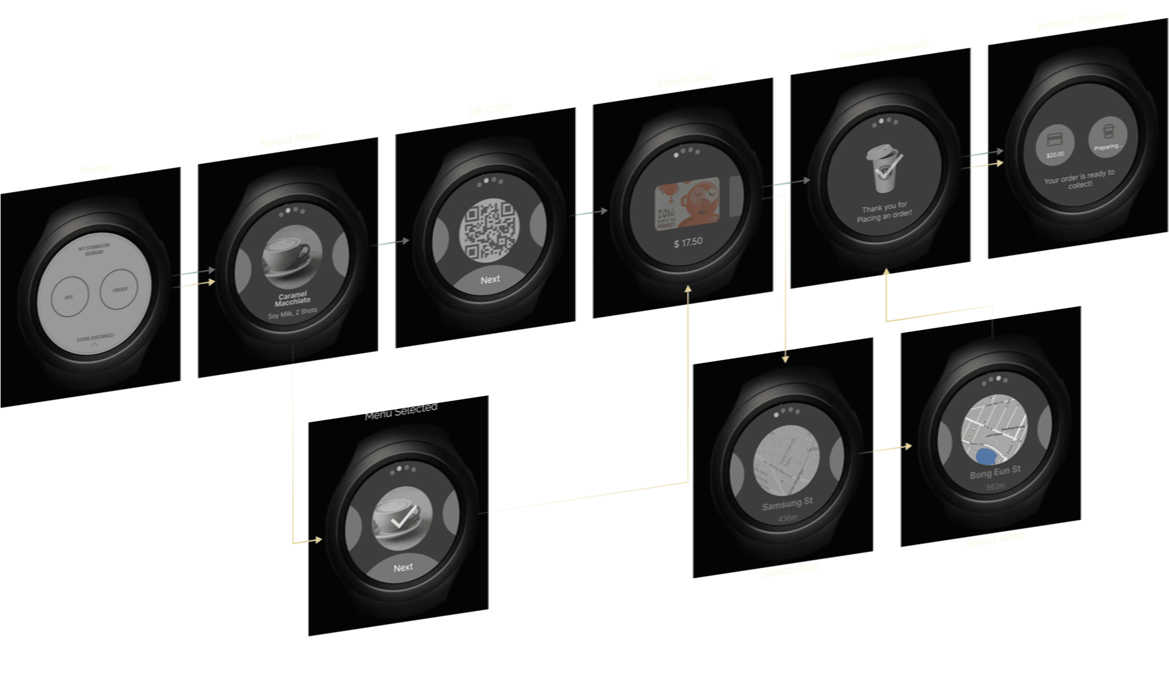
App Launch
The app detects the current location
Splash
Users are greeted by the familiar Starbucks brand
Home
The Starbucks app provides
two main menus on the home screen
The Nearest Store/
Distance from You
MSR
(My Starbucks Reward)
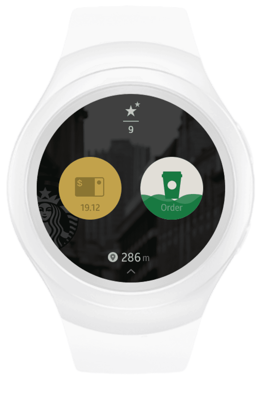
ORDER
(Order Ahead)
Card payment
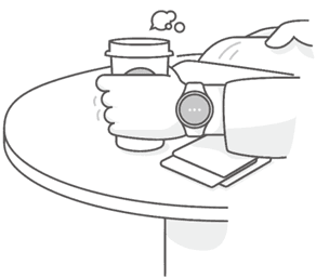
In-store order
Order what you want to drink by simple steps in store.
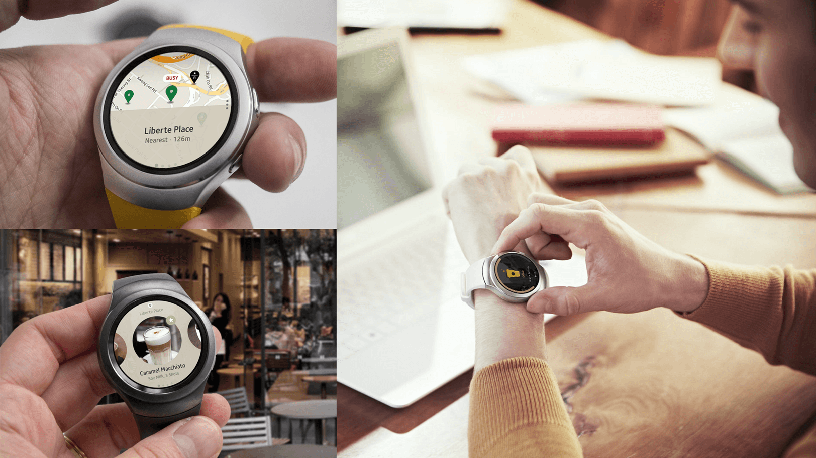
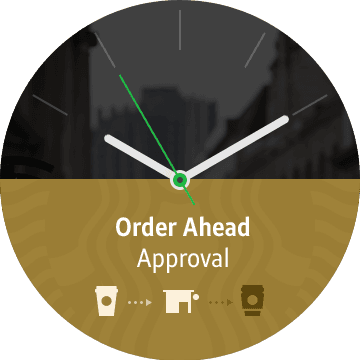
Siren Order (Order Ahead)
IOrder what you want to drink by simple steps in advance.
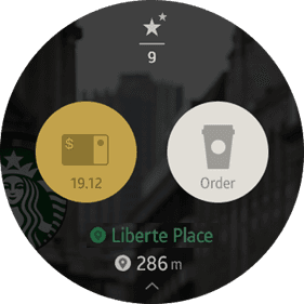
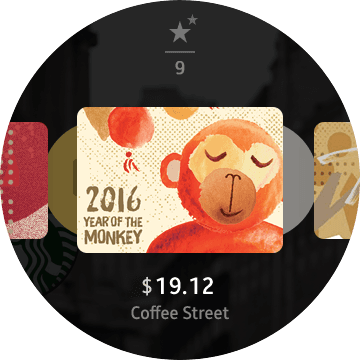
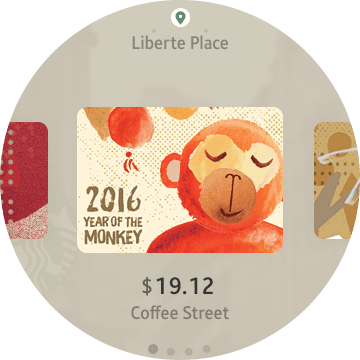
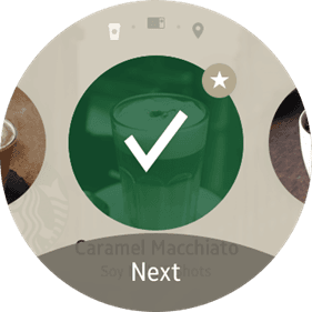
Select Payment
Select a Starbucks card as the next step.
Watch app provides only a Starbucks card
for payment.
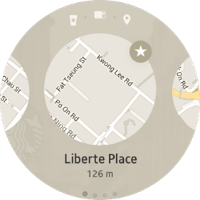
Select Store
Select a store to place an order.
From the nearest store to the current
location, and favorite store, it will be
shown to My Store list.
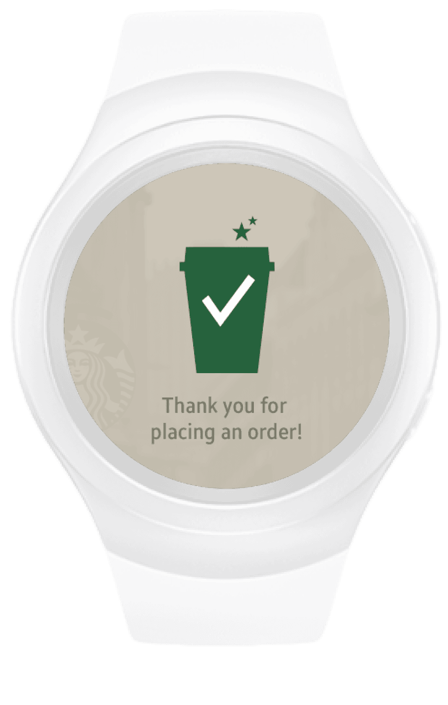
Complete
Your order is complete.
Home
You can check the order process through
main screen or watch face.
In Store - Home
If you are there in Starbucks, the current store
name will be displayed at the bottom of the
main screen.
And also the Order button will be turned into
‘In Store’ mode which can go directly to the
quick order.
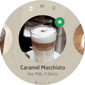
Select Menu
Select the desired menu. Since you are at
specific store to place an order,
your ordered menu will be directly placed
at the specific store.
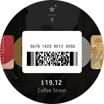
QR Code
Selecting a menu will show a QR code.
The menu will be flicked over to purchase
right away with the QR code that enables baristas
to put a prompt order. Or else,
go next to Select payment via Pay button.
Select Payment
Select a Starbucks card as the next step.
After completing this, your order will be placed
at the store you are currently in.

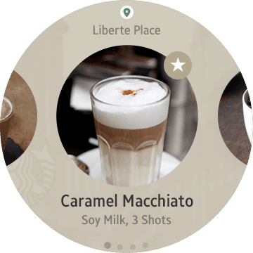
Select menu
You can simply order a drink that you
want to select as your own ‘Favorites’
registered in advance.
Menu Selected
Go to next step to purchase
when the menu is selected.
We asked Starbucks users.
To derive the key features of the watch, an online survey was conducted with 15 Starbucks app users and 15 smartwatch users. Additionally, in-depth interviews were conducted with 5 participants.
Q. What is the most frequently used feature in the Starbucks Mobile app?
Finding
nearby
stores
Mobile
Order
Ahead
Barcode/
QR Code
Payment
Starbucks
card
recharge
Q. If you were to use the Starbucks app on Gear S2, what would be the most useful feature for you?
Q. What is the most essential feature you need in the Starbucks Watch app?
Starbucks
delivery
Others

Choi So Yoon (26 Years)
Starbucks app user (College student)
"Wearing it on my wrist, it seems like paying with QR codes or barcodes would be faster."

Kim Joo Young (32세)
Starbucks app user (Office worker)
"After ordering, quick notifications about waiting times would be helpful."

Kim Jin Soo (47세)
Starbucks app user (Office worker)
"Displaying only essential information on the watch screen can enhance clarity and simplicity."
Finding nearby stores
Mobile Order Ahead (Siren Order)
Online store
Starbucks card recharge
Starbucks delivery
Others


Main Task Planning
I created scenarios for key tasks tailored to the Gear S2 environment and designed key screen based on these scenarios.
In-store payment
Order Ahead


Reactions
and
Comments
on
Posts
We asked Facebook users.
To derive the key features of the watch, an online survey was conducted with 15 Facebook app users and 15 smartwatch users. Additionally, in-depth interviews were conducted with 5 participants.
Q. What is the most frequently used feature?
Q. Is there a particularly useful feature for Facebook on the Gear S2?
Q. What is the most essential feature you would need in the Facebook Watch app?
Feed
Updates
Like
Photo
and
Video
Sharing
Others
Messaging
Messaging
Quick
Feed
Update
Each
Feature's
Detailed
Notification
Settings
Select-and-Send: Predefined Text List Feature
Create
New
Event
Others

Kim Jin Soo (36 Years)
Facebook app user (Small business owner)
"It would be nice to quickly see the key points of my friends' posts in a concise way."

Park Jin Hwan (31 Years)
Facebook app user (Office worker)
"Many people use the 'Like' function for posts in their feed. It's only natural that it would be available on the S2 as well."

Kim Jee Soo (28 Years)
Facebook app user (College Student)
"I wish I could upload and post photos or short videos from my watch."


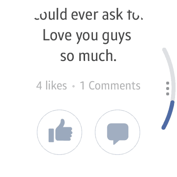
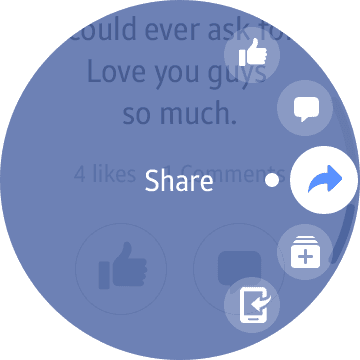
Feed / Like
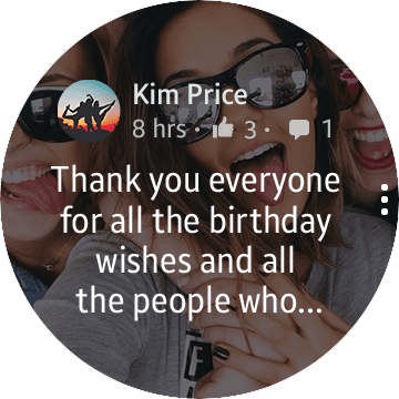
Let’s take a look at my feed.
Feed
One feed is provided in one page.
Use the bezel to view next feed.
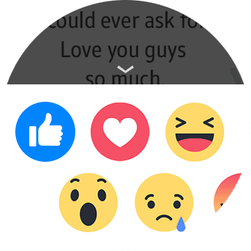
Like
Like can be done by double tapping each feed.
Emoji list
Let’s take a look at my feed.
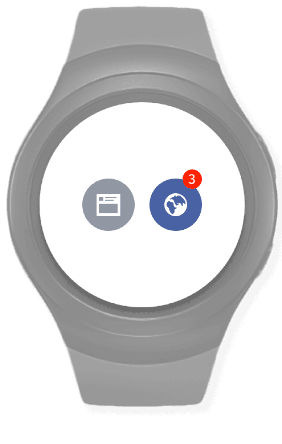
Notifications
3 notifications are received. Let’s check notifications.

Like / Comment
‘Like’ and ‘Comment’ are provided at the bottom.
Unread
Tapping notification will take user to
relevant posting or comment list.
If users go back, page will go back to
notification list.
Emoji list
Users are able to express variety of feelings.
Notifications
2 main menus (New feed, Notification) are provided.
Tapping notification of menu or watchface
will take users to notification list.

Main Task Planning
I created scenarios for key tasks tailored to the Gear S2 environment and designed key screen based on these scenarios.

What should be considered when designing the Gear S2 UX for the Facebook app?
Based on the key insights derived from user surveys, I have identified relevant keywords and insights that can be applied to Facebook App.
Coherence

Keep the main concept
Consistent in color and icon
Similar experience in navigation
Watch Context

Glanceable
Outdoor use
Fast and Responsive
Minimal User Interaction
Simple Task
Circular design + Rotary action

Attractive in circle
Rotate for main navigation

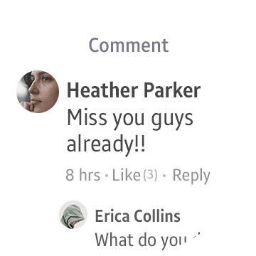
Comment
Users are able to confirm comments and leave a reply
Write a comment
‘Write a comment’ is provided at the bottom.
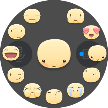
Various Input types
Various input types are provided.
Default sentences are also provided.
Emoji list
Use the bezel to select Emojis.
Text Input (Gear S2 keypad)
Type a comment with keypad.


App Launch
Let’s take a look at facebook app through My apps
Splash
This is how the launch page would
look like. Users will be greeted by
Facebook brand which is very familiar
Welcome
Welcome page provides user’s profile picture
and name. This page is synced with mobile
web and automatically logged in.
This page is provided for a moment.
Notification
2 main menus(New feed, Notification)
are provided.
Tapping on each menu will take users
to relevant views.


Copyright © 2025 Min Suk Kang. All rights reserved.