Service Type
UX Guideline
Project Status
Referenced in the creation of client's guidelines
Role
UX Leader | 35% (4 UX Team members)
Tool
Powerpoint, Illustrator, After Effects


SIC (Samsung Interaction Chart) standardization
A Pilot Project: Developing Standardization Guidelines for Chart Interaction at Samsung Electronics
The SIC project aimed to develop standardized UX guidelines for intuitive touch interactions based on chart information.
In 2015, Samsung Electronics had not yet finalized internal UX standard touch interaction guidelines for implementation in upcoming mobile phones and tablets.
Therefore, they initially commissioned our company to develop standardized user touch interaction UX guidelines based on chart information, which could be referenced internally at Samsung Electronics.
Based on various research findings, we developed user-centered touch interaction guidelines and delivered them to Samsung Electronics."
UX PROCESS
Competitor analysis
Desk research
Definition of chart elements
Defining features and user value of the chart.
Mapping touch interactions for each chart.
> Mapping touch interactions for each chart.
> Providing useful information in three dimensions.
> Exploring entertaining elements
Usability evaluation
Prototyping.
- Paper Sketches
- Wireframing (UI Definition & Workflow)
Discover
Define
Valiate
Ideate
Build
Benchmarking
I analyzed information delivery methods through competitors' charts to understand the mental models users typically had with chart-based interfaces.
MS PPT


Providing various bar chart forms and layout options
Offering diverse three-dimensional effects and theme group options for graphs
Enhancing data utility by
providing various file-saving options
Keynote


Providing 3D charts and chart animations
Offering interactive elements in charts, such as depth and movement, using texture and animation features
Apple E-book


Providing various three-dimensional effects and image representation options for graphs
Preventing difficulty in manipulation through the provision of handlers
Statsilk

Offering features specialized for information comprehension (Animation, Data Table, Full Screen Mode, etc.)
Providing playtime-based animations for charts and graphs (displaying data changes in animated form based on the timeline)
Consumer Barometer


Sequentially providing guidance pop-ups for setting up comparative data items
Extracting desired graph result data values to PDF (image) or CSV (Excel data) through detailed categorization
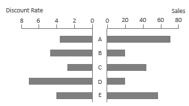
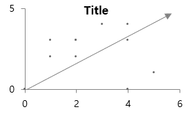
[Comparison of correlation relationships]

[In General]
Relationship Bar Charts are used when comparing two sets of data with different variables around a common set of items

[Comparing Correlations with an Emphasis on Expected Patterns]
A Scatter Chart is utilized when assessing the relationship between two variables based on the established expected pattern..
Classification of chart attributes
I classified the information attributes of the chart and analyzed the range of the chart that users typically understand.
Comparing components
Analyzing the proportional representation of
each element within the respective items
Trend comparison
Comparing Information Over Time: Understanding Trends
Item comparison
Comparing numerical values of multiple items
Comparison of correlation relationships
Comparing the proportional relationship
between two variables
Frequency comparison
Dividing incremental values into multiple ranges
and understanding the distribution status of frequencies
within each range


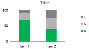
[Comparison of components]

[In General]
Pie charts are used for data with
a single series or up to 2-6 items
[For Multiple Series]
For data with more than one series, use
a percentage vertical bar chart (Column Chart)

[When representing the Proportion of Upper and Lower Classifications]
Doughnut charts are used when it's necessary to display both the upper classification
and its sub-classifications on a single chart, showing the proportion within each
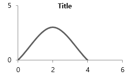
[Trend comparison]

[In General]
Horizontal bar chart, which allows for the most intuitive comparison of trends based on values

[Representing data accumulating over time]
A stacked column chart is used when comparing accumulated
values over time and comparing them with existing values
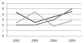
[Comparing trends between two or more series]
A multiple line chart is used to represent the trend of changes over time
in data with two or more series
[Item comparison]

[In General]
Bar charts are used for easy numerical comparison between each item and to quickly confirm the numerical ranking of all items at a glance

[Emphasizing Contrasting Item Values]
Deviation Bar charts are used to highlight exceptional results
[Frequency comparison]

[In General]
Distribution Column Charts are suitable for representing
the frequency distribution among approximately 8 items or less.
[Representing Accumulated Data Over Time]
Using a Line Chart is beneficial when there are more than 9 items or when the items represent continuous data over time, enabling the understanding of the frequency distribution of continuous data
Definition of chart elements
I defined the final set of chart elements to ideate, focusing on the most common and user-friendly types among various charts, including bar, line, pie, and radar charts.
Determined the target charts to provide various features and touch interactions


Finalizing Various Features
I categorized the features to be provided in the chart into basic features for novice users and advanced features for expert users.
Features designed for novice users,
offering simplicity and ease of operation
Basic Features

Advanced features designed for expert users,
enabling more specialized and in-depth information comprehension
Advanced
Features
Advanced Feature

Basic Feature
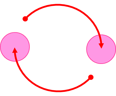
Defining Touch Interactions
Through the development of a diverse set of touch interactions, ranging from the most common one-finger tap
to two-finger and three-finger interactions, I proposed various possibilities for exploring chart information.


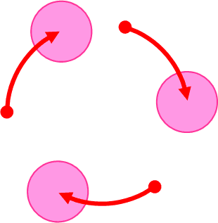
Touch Interaction SET
I categorized them into basic gestures and multi-finger gestures, enabling control over various features provided in the chart.
Multi-Finger Touch Gestures

Basic Touch Gestures


UI Definition & Use Flow
Touch Interaction Mapping: Planning Detailed Action Scenarios for Various Feature Lists
For a total of four graphs (Bar, Line, Pie, Radar), I have developed ideal usage scenarios by applying various feature lists and touch interactions.
Additionally, I considered useful and ideal touch interactions, along with elements of fun, by transforming charts into 3D during the scenario development process.


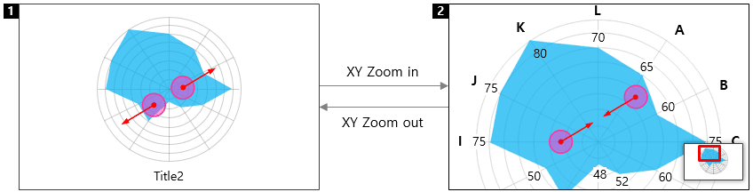

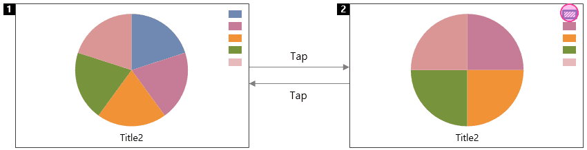


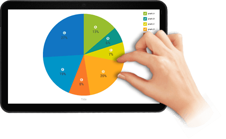
Select/deselect each legend to filter desired information within a radial graph
Zoom in on a specific information area in a radial graph to explore details
Hide and reveal information within a radial graph
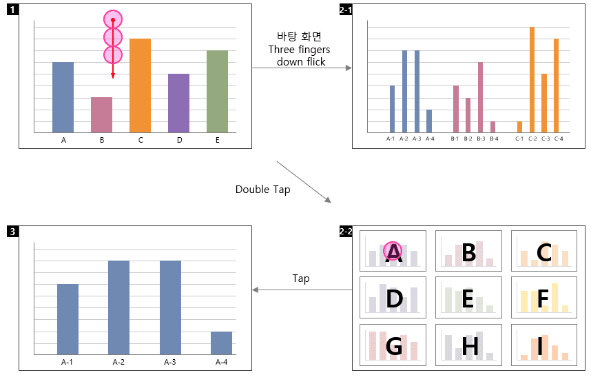
Quickly grasp sub-level details for each
item without the need to enter into lower-level information
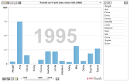
Enter into the detailed information of a specific bar in the X-axis area.
Access detailed information within each pie chart
Explore the desired information area through drag and drop
Zoom in and out in 3D view to quickly access desired information
Zoom in on a specific bar in the X-axis to explore detailed information
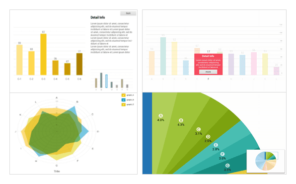
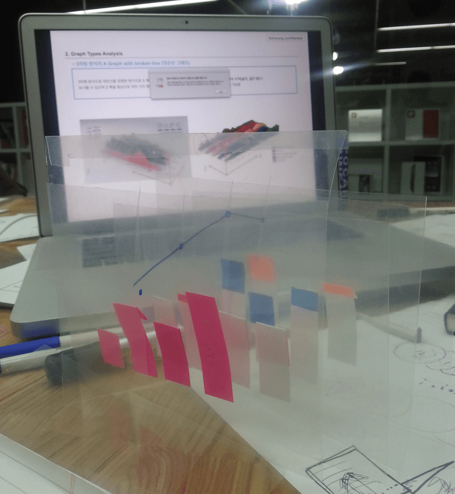
Design and Prototyping Proposal
Based on detailed UI scenarios, we conducted motion design for charts. Over a three-week period, I was part of the motion design team,
collaborating with motion designers to create prototypes for motions that users will experience during touch interactions.
I also designed and applied motions using Illustrator and After Effects, and the final results were presented to the client.
Color System
Color Table for Distinguishing Information in Graphs
#E2931B
#F39E1C
#FAB345
#F8C579
#198D83
#2C9991
#32AFA6
#63C2BB
#E2AF16
#F7CA1F
#FFD84F
#FFE48A
#1F95BD
#2CA5CE
#44B6DD
#65C7E8
#E58144
#F09259
#F79D68
#FAB083
#3C8CE1
#F4DD3B
#2CABBF
#A3D545
#C467BB
#7CC647
#FF8073
#E09A23
#BD41A8
#DDD200
#FB5DA6
#1173C4
#7547A4
#96BB2D
#F84C62
#F97729
#96BB2D
#0B938A
#DDD200
#FFA71D
#0093C9
#FFC400
#0B938A
#FFA71D
#F97729
#0093C9
#1173C4
#836F5A
A/B Testing
UI 상세 시나리오에 기반한 프로토타이핑 설계


Copyright © 2025 Min Suk Kang. All rights reserved.