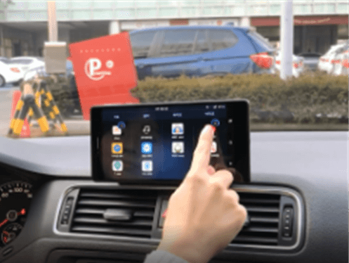
Service Type
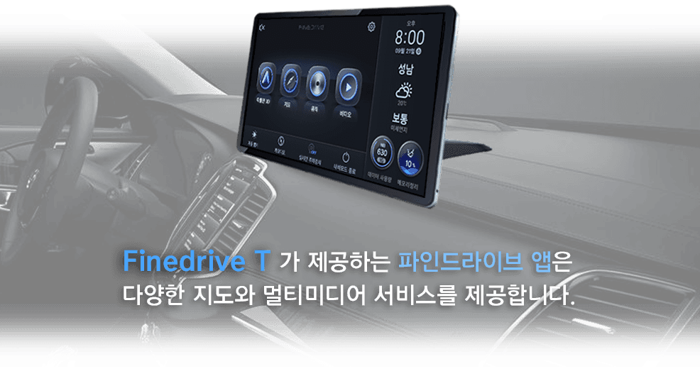
Navigation Infotainment System
Project Status
Launched
Role
UX Manager | 50% (5 UX Team members)
Tool
Powerpoint, Illustrator, Photoshop, Protopie

Pre-survey
2. Usability evaluation
3. Final interview


* During the evaluation, Break Time was added upon the user's request.

Within 15 minutes
Within 60 minutes
Questionnaire (7-point scale)
Evaluation of 6 criteria based on usability standards
Satisfaction measurement for each screen and task
Usability measurement for each screen and task
Within 20 minutes
Overall satisfaction and assessment comments on the navigation and infotainment system
Areas requiring further improvement
Additional ideas
Ice breaking
Average daily driving time
Usage of in-car navigation apps and other applications while driving.
Thoughts on aftermarket AVN (In-car entertainment) products
Opinion about Findrive products
description of products to be evaluated
TASK & INTERVIEW
Understanding of the screen
Completion of the given task
Feedback on the performed tasks
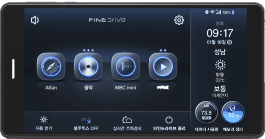
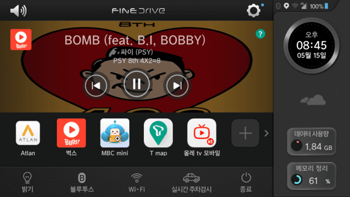
Basic Mode
Intro
Music Focus Mode
Recommended Music Listening (AI feature)
Driving Focus Mode
Welcome
Navigation
Music Player
Custom Mode
Recommended Nearby Traffic Information (AI feature)
All Apps
Quick Menu
Real-time Parking Monitoring
Change Running Apps
Delete Running Apps
App Editing
Memory Cleanup
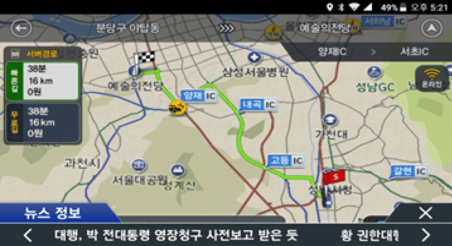
Navigation
Destination Search and Configuration
First impressions about motion and design
Welcome UI and AUI /Provided Time/Resolution
App Folder Creation Method, App Installation, Deletion Method, App Launch Speed,
Touch Response Speed
Music Player Control Method, Automatically Play Previously Listened Music (Streaming Music App)
When Ignition On (with waiting time until playback starts), Touch Response Speed
Information Layout for Displaying All Apps, App Launch Speed, Touch Response Speed
Recent Destination Information and Quick Destination Search Feature, App Launch Speed,
Touch Response Speed
App Installation, Movement, Deletion Methods, App Launch Speed, Touch Response Speed
App Installation, Deletion Methods, App Dragging Movement Speed, Touch Response Speed
Structure of Impact Notification List and Impact Event Information, Touch Response Speed
Usage of Music Player and Control Buttons While Driving
Timing and Size of Pop-ups Displayed While Driving, Comprehensibility of Messages
Position of Quick Menu, Number of Apps Displayed and Animation Effects When Quick Menu is Selected
Method for Changing Destination or Adding/Removing Waypoints, Navigation Guidance/
Method for Voice Search
Timing and Size of Pop-ups Displayed While Driving, Comprehensibility of Messages
Button Placement, Comprehensibility of Messages Displayed During Memory Cleanup, Speed of Memory Cleanup Completion After Execution
Size of the Running App List and Button, Layout for Displaying the List of Running Apps,
Speed of App Switching
Button Size, Layout for Displaying the List of Running Apps, Speed of App Deletion
Ignition On
Getting in the car
Driving
Assessment criteria
Screen
Task
Survey
Interview
[Specific evaluation criteria]
Each screen was structured with the following survey items
Metaphor

Clearly conveying meaning using
commonly known and universally
accepted knowledge for
widespread understanding
Conceptual Model

Facilitating the direct understanding of interactive elements' functionality by users.
Assessing whether the on-screen content is presented in a way that allows users to accurately understand and take appropriate actions
Perceived Stability

Encouraging systematic and
stable perception of information
through effective classification
and placement of visual elements
Determining whether information
is classified and arranged
in a way that can be effectively
perceived while driving.
Visibility

Enabling the user to directly
understand the functions of
the user interface elements
Perceiving the visibility of
screen elements, such as text
size and color contrast
Simplicity

Simplifying the workflow and
provided information to
enhance user convenience
as much as possible
Verifying if the screen is presented
in a concise manner to avoid
distractions while driving
Cognitive Naming

Clear Naming
Effective Naming Order :
Shape → Symbol →
Text Label → Explanation
Enabling users to directly understand
the functionality of interactive elements
[Usability evaluation criteria]
I conducted the evaluation based on the key six usability assessment elements selected from various usability evaluation factors.
I conducted the test on a total of 29 key screens as follows.
Intro
Welcome
Evaluation
Task
[Task Scenario]
The entire scenario is designed based on the user's vehicle usage behavior, covering the process from boarding to disembarking.
Basic Mode
Driving-Centric Mode
Music-Centric Mode Custom Mode
All Apps
App Editing
Real-time Parking Monitoring
Navigation
Finedrive Settings
Linking Parking Impact Notifications with the Phone
Data Usage Settings
Navigation Auto-launch Settings
Help
Reset
Music Player
Navigation
Recommended Music Listening (AI feature)
Recommended Nearby Traffic Information
(AI feature)
Quick Menu
Memory Cleanup,
Switch Running Apps
Delete Running Apps
News Info when the vehicle stops during driving
Traffic information during traffic congestion
Switching between Finedrive mode and Tablet mode
Screen settings
Volume control
Changing home screen mode
Getting off
the car
Getting
in the car
Ignition On
Driving
Stop
Parking

Onboarding Guide for Navigation Launch


User Feedback
90% of users liked the image-centered tutorial, but some suggested smaller text and a more intuitive animated guide.

Too much text makes
it difficult to focus

Having lively animations
would make it easier to
understand
7-Point Scale
Usability Evaluation Results
1
2
3
5
7
4
6
Overall Usability
Average
6.5
6.5
6.0
6.0
5.5
3.5
6.2
6.4
[Key Screen Evaluation Results]
Home Screen: Music-Centric Mode

User Feedback
It would be nice to have additional buttons, such as shuffle play and repeat,
commonly provided in music apps and the size doesn't need to be larger
than the main control buttons.
Since the album covers are visible, it feels intuitive to
understand
I'd like bigger music
control buttons
7-Point Scale
1
2
3
5
7
4
6
Overall Usability Average
5.5
5.5
6.5
5.5
6.0
5.5
5.6
5.3
Usability Evaluation Results
News Alerts During Stops

User Feedback
Being able to quickly switch news categories or browse and select articles from a list could be useful.
I'd like a button to change the news category.
The speed of the
moving text seems
a bit slow.
Usability Evaluation Results
1
2
3
5
7
4
6
7-Point Scale
Overall Usability
Average
6.5
6.5
4.5
5.0
4.5
6.0
5.5
4.5
App Editing on the Home Screen


User Feedback
Initial app setup and editing on the home screen might not be intuitive.
Clear guidance on app installation, registration, and editing during the initial setup would be helpful.
Registering apps on the home screen during initial use might be difficult.
Clear instructions on
how to register apps on the
home screen would be good.
7-Point Scale
Usability Evaluation Results
1
2
3
5
7
4
6
Overall Usability Average
3.5
3.5
3.0
6.0
3.5
4.0
3.3
4.2
Copyright © 2025 Min Suk Kang. All rights reserved.